Results of 2018 Audits: Universities
Our dashboard is interactive visualisation tool summarising the financial statement data for all Victorian universities.
Do you need help using the dashboard? Read our dashboard instructions.
Dashboard instructions
|
General instructions for all pages |
|
|
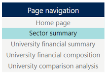
To navigate between pages in the dashboard, use the page navigation buttons on the left side of each page. |
|
| The dashboard is easiest to navigate in the full screen view. Click the button at the bottom right of the window. | |
| To access a detailed view of each chart, hover over the chart and click the ‘Focus Mode’ button at the top right of the window. |
|
| To return to the dashboard from ‘Focus Mode’, click ‘Back to Report’ at the top left of the window. |
|
| To share the link to the dashboard via email, LinkedIn, Facebook or Twitter, click the ‘Share’ button at the bottom right of the window. |
|
|
Specific selection instructions |
|
|
Home page |
|
|
When opening the dashboard for first time, you will reach the home page.
|
|
|
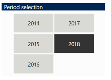
Period (financial year) selection |
|
|
The dashboard contains data from the past five financial years.
Note: the years selected in a page will be applied across all pages of the dashboard. |
|
|
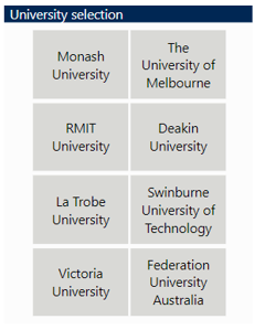
University selection |
|
|
You can explore the data by selecting universities in the dashboards.
Note: the universities selected in a page will be applied across all pages of the dashboard, except for the ‘University comparison analysis’ page. |
|
|
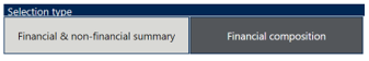
Sector summary |
|
|
There are two selection types for the sector summary page which will show different charts. The dark grey colour shows the selected option.
|
|
|
University financial composition |
|
|
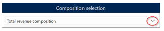
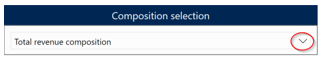
Click the downward button to expand and make your selection. |
|
|
University comparison analysis |
|
|
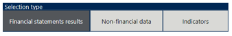
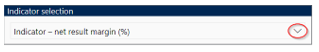
This page allows you to visualise up to two charts. Select a data type that you want to show (financial statements results, non-financial data or indicators). The dark grey colour shows the selected option.
Repeat the above process for the second chart. Note:
|
|